Notable Film Posters of the Decade: Part I
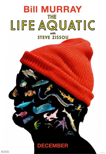
Teaser poster for The Life Aquatic with Steve Zissou (2004)
Many films have been released within the past 10 years, and with each film released, there are one or more versions of poster art released to promote the film. There are the teaser posters; the primary posters; the alternate second versions; sometimes even a third version. Multiply the amount of films released within the past decade, let’s say by three, and the sum is titanic (get it, Titanic?). Given this immense amount of posters, Dinca must divide the best and worst posters into multiple posts, and we’ll be posting up until the New Year. Perhaps, if we’re feeling ambitious, we may even select a Top 10 list for the past decade, however, with so many posters, it’s hard to rank, and it’s even more difficult to recall which films had great posters. Well, great posters are memorable — we’ll use that as our guiding light.
What makes a good poster; what are we looking for? Great poster art makes someone want to see the movie even if they know nothing about the film. It propels someone to get on the internet to research the film. Maybe they will go out of their way to watch the trailer instead of waiting around to be force-fed by a convenient television trailer. If the poster is really great, it will recruit an army of patrons, an army that wants to go out of their way to promote the film; spread the word; generate a buzz; hell, even blog about it, notwithstanding they haven’t even seen the film yet.
Certainly, great design and great typography are part of creating a great poster — the design can be innovative or a tried-and-true formula of the past — more importantly, though, the poster must best represent the story of the film, the motifs of the film, the tone of the film, and it needs to visualize the thematic elements of the film. Sometimes film posters are a big let down — usually when a poster propels you to see a movie, and then you watch it, only to find that the movie sucks. When this happens, we should salute the designer, because their design made a shitty movie look worthy of your time.
In addition to teaser poster for Wes Anderson’s The Life Aquatic with Steve Zissou, which is posted above, we have posted nine more admirable film posters below. Feel free to voice your opinions, critiques, and definitely nominate a candidate for your favorite film poster of the past decade, or nominate an atrocious poster. Ride with us as we ride through our mega-list.

Kelly Reichhardt’s Wendy and Lucy (2008)
Okay, so people are split on this film. Personally, I thought this was a solid indie film. Some people thought it was boring; I felt it was a little film that told a great story with a scant budget. The Michelle Williams star power helps and she played the Pacific Northwest hippie-drifter role accurately. If I were to classify this film, I’d place it in the new, emerging genre of what I dub American-neorealism, a genre that’s minimal and sparse — which, for some is painfully boring, but these films are very true to life, and life can be incredible boring sometimes.
Great use of typography in this poster. Back when this film was screening, I’m remember surfing the net, and on a message board I found someone’s criticism that was something like “Come on, fuuuucccck, how many damn indie posters are set in Helvetica with some god damn indie-art still from the film.” Sorry dude, that ain’t Helvetica, it’s DIN, DIN Medium or something.
What funny is the quote placed at the top from Manolha Dargis of The New York Times. I wish I had a dime for every time Dargis and A.O. Scott describe a film as a pitch perfect triumph.
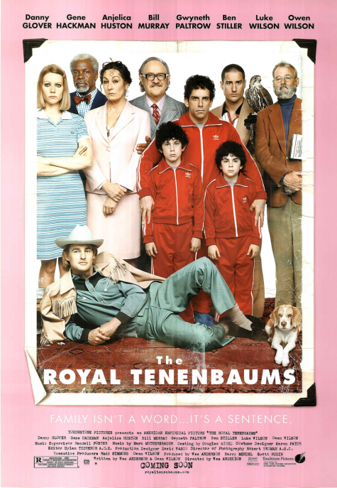
Wes Anderson’s The Royal Tenebaums (2001)
Here we have another Wes Anderson poster. Wes Anderson reliably pimps-it with his artwork. He loves the Futura font and Futura has become his signature look. On numerous occasions, I’ve heard people say stuff like “I want Wes Anderson titles” or “I love Wes Anderson titles.” He made an impact.
Anderson often, if not always, collaborates with his brother on his artwork. His brother is a talented artist too.
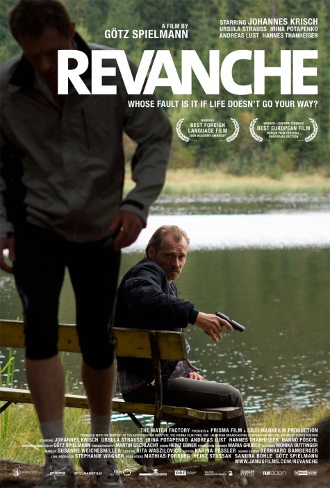
Götz Spielmann’s Revanche (2008/2009?)
Great film, great artwork — par for the course for a fantastic company like Janus Films. Neat choice of font, I can’t identify it, but it works well for 2008-2009, because chubby, heavy, condensed sans-serifs were the hot choice for 2008 and 2009. Saturday Night Live uses a similar font, as does The Atlantic Monthly, whom recently began setting their headlines in the Titling Gothic family, notably with versions akin to Titling Gothic Compressed Black, which was implemented after a 2008 design makeover by Pentegram’s Michael Beirut.
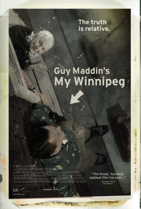
Guy Maddin’s My Winnipeg (2007)
Probably the best artwork for a Guy Maddin film. Actually, I’m planning on devoting a future post entirely to titles in Guy Maddin films. A few months back, I wasted hours of my afternoon trying to identify what font Guy Maddin uses. It’s Berlinsans.
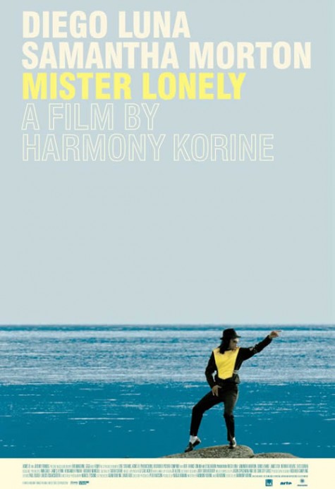
Harmony Korine’s Mister Lonely (2007)
My friend and I saw Harmony Korine in person when he screened Mister Lonely in Chicago during its release. With fantastic, visual moments, the poster-izable moments like that of above, the film won me over. The film was exciting on the big screen, however, re-watching the film on the small screen proved to be a disappointment. Sadly, the poster art for Mister Lonely is better than the film.
Shira Geffen’s Jellyfish, aka Meduzot, (2007)
Hey, lookee here, similar color scheme as the previous, and both films came out during 2007. Jellyfish is from Iran, and Mister Lonely from the US, but which film is the copy-cat? Both films are set around water and yellow type looks great with that aqua blue. Even though Jellyfish won big-time at Cannes, I can’t say I’d recommend watching the film.
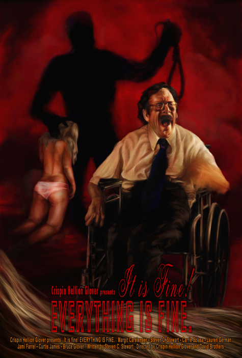
Crispin Glover’s It is Fine! Everything is Fine, (2007)
Okay, the type is dog-poop ugly, but the still image represents the film perfectly. I and some friends saw Crispin Glover in person when he was touring with this film. The film is bizzarre — highly recommended — however, Crispin adamantly declares the film will never see a DVD release. Side note: Crispin explained the he acts in movies like Charlie’s Angels, Willard, etc., to finance his own films, films that have seemingly no ability to break even financially, nor turn a profit.
The Coen Brothers’ Burn After Reading, (2008)
Nice custom type and design, but what’s remarkable is the decision to exclude George Clooney and Brad Pitt from the poster art.
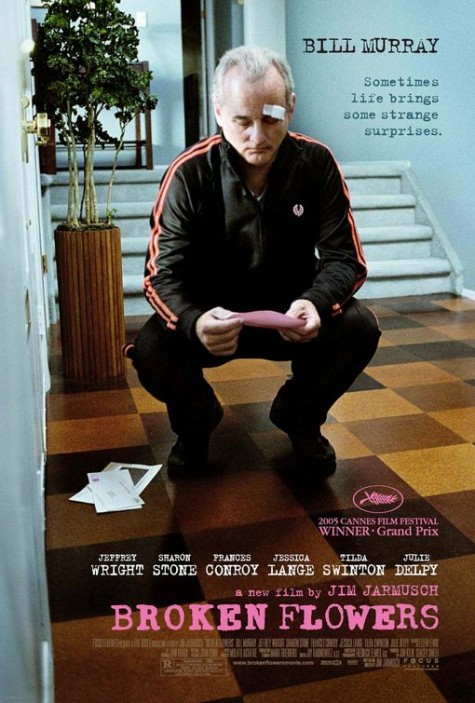
Jim Jarmusch’s Broken Flowers, (2005)
A Jim Jarmusch film. Bill Murray. Bill Murray in a tracksuit.

