Notable Film Posters of 2010 Part 1
Film posters. Film promotion and marketing. Hollywood. Cinema as business. DINCA does not report box office numbers nor marketing dollars, but DINCA does know how to Google search and Wikipedia. According to Wikipedia, “Marketing budgets [for Hollywood feature films] tend to equal anywhere between half or three times the production budget.” This general statement does not apply to all of the posters hereafter, but it does apply to the Gulliver’s Travels (2010), pictured above — one hell of a poster — recently, I saw a thick stack of these posters abandoned at the local movie theatre. Jack Black looks great on the print. This film surely will be a fun ride. Why? Beacause it’s “From the studio that brought you ‘Night at the Museum.'”
The film poster is a visual object that sells its event. Through its design, we discern what the film is about, the tone of the film, the technology, and so forth. Design is a crucial element in promoting the arts; however, print promotion is not always necessary underground.
Let us take a look at the good, the bad, and the absurd film posters of 2010.
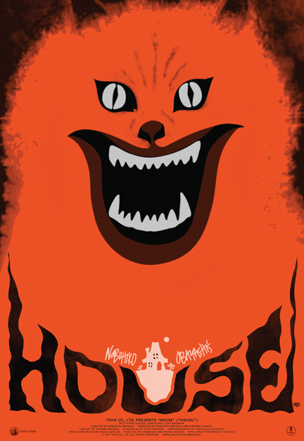
Nibuhiko Obayashi’s House was originally released 1977 in Japan. It had a nice run, and then it hibernated for 30 years until Janus Films bought the distribution rights sometime around 2009. Janus had intentions on releasing House as part of their Eclipse line of dvds. Apparently, the Eclipse line was originally conceived as a sub-label for cults films. Janus distributed House, and Criterion Collection recently released House on dvd.
Beautiful. The film poster for House was designed to promote the 2010 North American theatrical tour of the film. This poster was inspired by the original Japanese poster, pictured above. The re-release poster is clean and bold with orange and black color; however, I admire the graphic and typographic clutter of the original ’77 poster and find it quite endearing.
I do not know much about this film. Looking at the poster makes me want to see it as soon as possible. More info here via MUBI.com.
Simple poster for an allegedly simple film. Typography looks nice, yellow type against the green foliage is inviting. The photograph covers ground, spanning from the pool, to the lounging couple, to the foliage, to the resort.
This poster sparkles and streaks and represents all the glamour and glitz of that Cannes yacht party in all its fulsomeness. Juliette Binoche (Cache, 2005, The English Patient, 1996) poses with a magic paintbrush that streaks CGI gleam. The shadow on her face is odd.
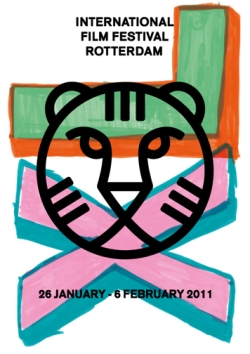
Graphic design vanguard. Tasty. IFFR refresh of the tiger identity with paint (perhaps marker) XL hand-lettering.
Bold design in a two color print. Great use of red. Poster for the 2010 IFFR, released in 2009.
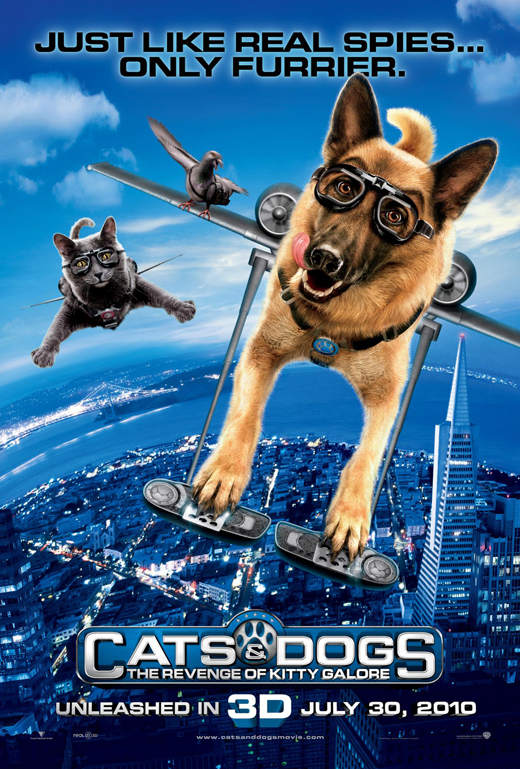
What kid would not want to see this 3D movie after sighting this. Great tagline, “Just Like Real Spies … Only Furrier,” and then we have the release date prefaced by “UNLEASHED IN 3D.” A cat, a dog and a tag-a-long pigeon fly over the city, jetpacked and goggled. The luster photoshop job on the animals recalls a few recent Adam Sandler movie posters, particularly Grown Ups (2010).
Much like the Cats and Dogs poster, this poster Grown Ups implies that you are in for a fun ride. Hyper-realist photoshop job on this puppy. This poster hints that the apex of the movie is the great water-pater visit (?). I love riding the water slides. A fun ride.
This poster communicates f*ked up baby mutant in a gooey thriller.
And we finish appropriately with alternate poster for Gulliver’s Travels.
Stay tuned for a tentative Part 2 of notable film posters.


