Michael Bierut on Banknote Design
The following is copied verbatem from an Atlantic Monthly Article. Read the entire Atlantic article here.
Pentagram’s Michael Bierut analyzes the world’s best and worst banknote designs.
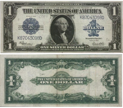
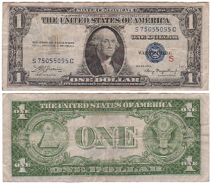
The dollar bill evolved over the next 60 years. By 1923, its front looked pretty much as it does today. The complex filigree was intended to confer value onto printed paper while discouraging counterfeiters. The reverse of the bill, however, was relatively simple, the denomination centered in a complex frame.
The back side of the dollar bill assumed its current design during the Great Depression. Here we have all the elements that fascinate conspiracy theorists, from the broken pyramid with its all-seeing eye to the curiously constructed Latin inscriptions. (Annuit Coeptis literally means “It favors the things having been begun,” but is usually translated as “He [God] has favored our undertakings.”) The effect is a cake that has been decorated to within an inch of its life.
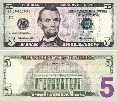
All this decoration, though, has somehow never gotten enough ahead of counterfeiters, so our currency has been redesigned to incorporate new features like microprinting, colors, watermarks, and security threads. The more-is-more design aesthetic also had the effect of making all the different denominations look even more alike, especially for people with vision problems. So enter the big purple numbers that now appear in the corners: a solution as inelegant and clumsy as a denim patch on a satin dress.
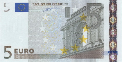
The world’s other dominant currency is the euro. Its pleasant banknote designs by Austrian Robert Kalina feature bridges, gates, and windows that vaguely resemble specific European landmarks but are in fact generic. The euro has one great advantage over America’s currency system: rather than big purple numbers, the bills are distinguished by size. They range from 120 x 62 mm (€5) to 160 x 82 mm (€500). The bigger the bill, the more it’s worth. Simple.
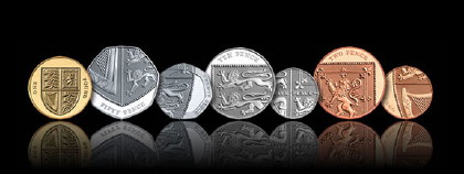
Without a doubt, the most acclaimed currency design in recent years isn’t for paper money. It’s 26-year-old Matthew Dent’s competition winner for Britain’s new coins. Ingeniously, Dent divided the shield of the Royal Arms into six fragments, which appear on the 1p to 50p coins. The shield in its entirety appears on the £1 coin. The result is a transformation of a medieval heraldic device into a strikingly contemporary and dynamic insignia.
Read the entire Atlantic article here.

1 Trackback or Pingback