Typography: Stanley Kubrick, Futura, and Film Poster Art

U.S. 1 One Sheet Original Movie Poster 27×41 for Lolita
If I remember correctly, Stanley Kubrick’s favorite typeface, according to Michael Bierut in his book 79 Short Essays on Design (discussed in the essay “Stanley Kubrick and the Future of Graphic Design”), is Futura Bold. Notably, Kubrick used Futura in the title sequence and poster art for 2001: A Space Odyssey (1968). In this poster art for the US release of Kubrick’s Lolita (1962), we find a light-ish condensed version of Futura, along with a heavy version of Akzidenz-Grotest, and a stencil typeface that I can’t identify. It’s 1st edition of the US release for Lolita and has sold for up to $1800.00.
Below are some of my favorite Stanley Kubrick film posters.
“The Ultimate Trip”, 2001: A Space Odyssey
Futura in use on the bottom of the poster.
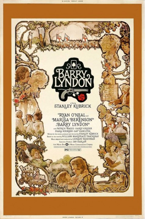
Barry Lyndon (1975)
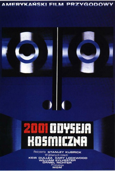
Polish poster art for 2001
3rd version of 2001
Futura in use again.
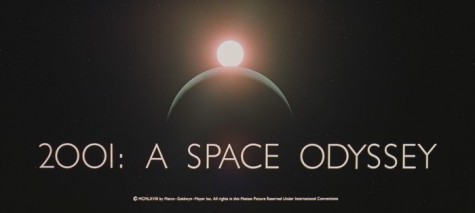
Opening Title: 2001: A Space Odyssey
Again, Futura in use.
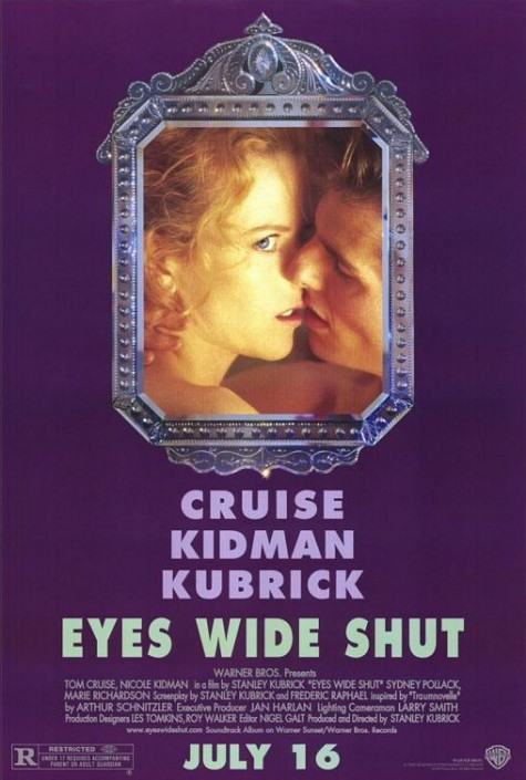
Eyes Wide Shut (1999)
Futura Bold
More:
“Stanley Kubrick: Fan of Futura” | Typographica
IMDB: Stanley Kubrick
Video: Michael Bierut Talks Typography with ‘The Atlantic’


3 Comments
The first and third 2001 posters are set in Gill Sans, not Futura, and the Lolita one looks like Akzidenz Grotesk, but it’s definitely not Helvetica…
Snoid, great thanks for the corrections.
By the way, I don’t know how I didn’t recognize Gill Sans, because I hate Gill Sans.
1 Trackback or Pingback